Working with pivot tables in Excel.
This part of the tutorial describes in detail how to create a pivot table in Excel. This article was written for Excel 2007 (as well as later versions). Instructions for earlier versions of Excel can be found in a separate article: How to create a pivot table in Excel 2003?
As an example, consider the following table, which contains company sales data for the first quarter of 2016:
| A | B | C | D | E | |
|---|---|---|---|---|---|
| 1 | Date | Invoice Ref | Amount | Sales Rep. | Region |
| 2 | 01/01/2016 | 2016-0001 | $819 | Barnes | North |
| 3 | 01/01/2016 | 2016-0002 | $456 | Brown | South |
| 4 | 01/01/2016 | 2016-0003 | $538 | Jones | South |
| 5 | 01/01/2016 | 2016-0004 | $1,009 | Barnes | North |
| 6 | 01/02/2016 | 2016-0005 | $486 | Jones | South |
| 7 | 01/02/2016 | 2016-0006 | $948 | Smith | North |
| 8 | 01/02/2016 | 2016-0007 | $740 | Barnes | North |
| 9 | 01/03/2016 | 2016-0008 | $543 | Smith | North |
| 10 | 01/03/2016 | 2016-0009 | $820 | Brown | South |
| 11 | ... | ... | ... | ... | ... |
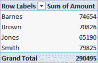
First, let's create a very simple pivot table that will show the total sales volume of each of the sellers according to the table above. To do this you need to do the following:
The pivot table will be filled with the sales totals for each salesperson, as shown in the image above.
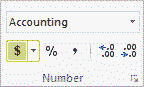
If you want to display sales volumes in monetary units, you must customize the format of the cells that contain these values. The easiest way to do this is to select the cells whose format you want to adjust and select the format Monetary(Currency) in the section Number(Number) on the tab home(Home) Excel menu ribbons (as shown below).
As a result, the pivot table will look like this:
Please note that the default currency format depends on your system settings.
Many office users often encounter a number of problems when trying to create and edit any office documents. This is often due to the fact that companies use several office programs, the operating principles of which can vary greatly. An Excel pivot table can be especially problematic.
Fortunately, MS Office 2010-2013 appeared relatively recently, which not only includes a number of updated programs for processing text files, tables, databases and presentations, but also allows several workers to work with them simultaneously, which is simply invaluable in a corporate environment.
Why new versions?
To understand this issue, you need to imagine all the most significant changes that have occurred with this office suite.
As before, Excel is the second most popular program, which allows you not only to create simple tables, but even to create quite complex databases. Like other components, an “Office” button has been added to it, by clicking on which you can save the document in the format you require, change it, or specify the required measures to protect it. The document security module has been significantly updated.
As for the most significant changes in Excel, it should be noted that many errors in formulas have been corrected, which is why in previous versions quite serious errors in calculations often occurred.
It must be said that a new version The package is not just a set of office programs, but also a powerful tool suitable for solving even very complex problems. As you can understand, today we will look at an Excel pivot table.
What is it and what is it for?
The most significant change in the new versions of Office is their completely redesigned interface, which the creators called Ribbon. In the feeds, all 1,500 commands are conveniently grouped into categories, so you won’t have to search for them for long. To fully comply with these parameters, the developers have also added improved pivot tables to Excel.
 Today we’ll look at Excel “for dummies”. Pivot tables are a special tool that visually groups the results of a process. Simply put, with their help you can see how many of certain goods each seller sold during his work shift. In addition, they are used in cases where it is necessary:
- Prepare analytical calculations for writing final reports.
- Calculate each of their indicators separately.
- Group data by type.
- Perform filtering and in-depth analysis of the received data.
In this article we will look at simple ways their creation. You will learn how an Excel pivot table helps you create and analyze time series, create and analyze a forecast in more detail.
Create the required document
So how to create a pivot table in Excel? First we need to create a simple document into which we enter data for subsequent analysis. There must be one parameter per column. Let's take a simple example:
- Sales time.
- Sold item.
- Total sales cost.
Thus, a connection is formed between all the parameters in each specific column: suppose that the sneakers were sold at 9 o’clock in the morning, and the profit was n-rubles.
Formatting a table
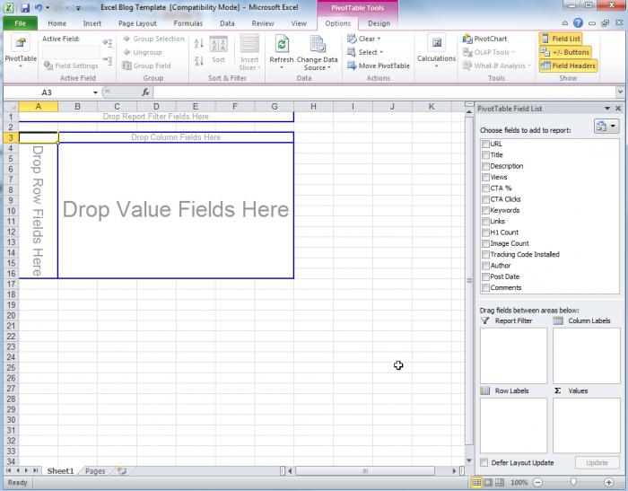
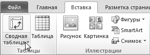
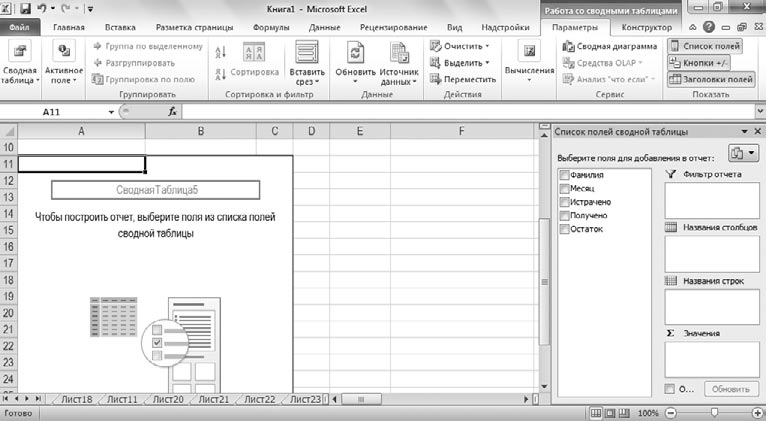
 Having prepared all the initial information, place the cursor in the first cell of the first column, open the “Insert” tab, and then click on the “Pivot Table” button. It will immediately appear in which you can perform the following operations:
- If you immediately click on the “OK” button, the Excel pivot table will immediately be displayed on a separate sheet.
- Fully customize output.
In the latter case, the developers give us the opportunity to determine the range of cells into which the required information will be displayed. After this, the user must determine where exactly the new table will be created: on an existing sheet or on a newly created sheet. By clicking “OK”, you will immediately see the finished table in front of you. This completes the creation of pivot tables in Excel.
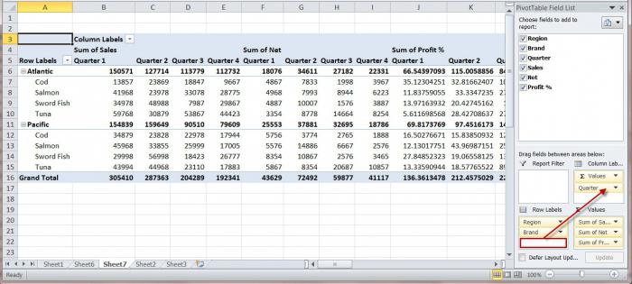
On the right side of the sheet are the areas you will be working with. Fields can be dragged into separate areas, after which the data from them will be displayed in the table. Accordingly, the pivot table itself will be located on the left side of the work area.
By holding down the left mouse button on the “Product” field, send it to the “Line Names”, and in the same way transfer the “Sum of all sales” item to “Values” (on the left side of the sheet). This is how you can get the amount of sales for the entire analyzed period.
Creating and grouping time series
To analyze sales for specific time periods, you need to insert the corresponding items into the table itself. To do this, you need to go to the “Data” sheet and then insert three new columns immediately after the date. Select the column with and then click on the “Insert” button.
It is very important that all newly created columns are located inside an already existing table with the source data. In this case, you will not need to create pivot tables again in Excel. You will simply add new fields with the data you require.
Formulas used
 For example, the newly created columns can be named “Year”, “Month”, “Months-Years”. To obtain the data we are interested in, we will have to enter a separate formula for calculations into each of them:
- In “Annual” we insert a formula of the form: “=YEAR” (referring to the date).
- The month must be supplemented with the expression: “=MONTH” (also with reference to the date).
- In the third column we insert a formula of the form: “= CONCATENATE” (referring to the year and month).
Accordingly, we get three columns with all the original data. Now you need to go to the “Summary” menu, click on any free space in the table with the right mouse button, and then select “Update” in the window that opens. Note! Carefully write formulas in Excel pivot tables, as any mistake will lead to inaccurate forecasts.
How to spend by year?
Again, left-click on the “Year” item, then drag it to the “Column Names”, after which the pivot table begins to display the results of sales of a specific type of product for all years. What if you also need to analyze monthly sales? In the same way, hold down the “Month” LMB, dragging it under the annual column.
To get a visual overview of monthly changes in sales by year, the “Month” field needs to be dragged directly into the annual column, which was previously moved to the “Column Names”. After performing this operation, you will see the table in the following view:
- The total sales of a particular product for the entire year.
- The dynamics of sales of each of them by year.
Removing data from the results
Let's assume that we need to remove data for October from the search results, since we do not have complete statistics for it. In the pivot table, look for “Report Filter”, and then drag “Year - Month” onto it.
A filter appears above the table in which you need to check the box next to the “Select multiple elements” item. After that, in the list that appears, uncheck the box for October, and then click on “OK.”
Thus, you can add and remove elements from the filter, creating analyzes that are truly relevant and necessary for you. The program will automatically calculate indicators for the months that interest you, clearly displaying the dynamics of changes in indicators.
We calculate forecasts
Let's try to predict sales results for some time in advance. To do this, you must first disable general totals so that they do not introduce inaccuracies into the created forecast.
To do this, place the cursor in the “Grand Total” field, and then click on the “Delete Grand Total” button. After this, we execute the Excel pivot table in the manner described above (right-click and select “Refresh”).
As a result, this data disappears from our pivot table. To build a visual display of sales forecasts, place the cursor on the year from which we plan to start, and then left-click on the “Chart Forecast Model” button.
 After this, a beautiful and informative graph appears, which visually presents the predicted results of purchasing activity according to the forecast you are interested in. This will save you energy and save money that can be used to purchase truly necessary goods.
We use other data sources to create a pivot table
It's time to look at more advanced Excel lessons. A pivot table can be created from documents that have been edited by other users.
The “Merge” function will help us with this. This program allows you to automatically combine the text of a document and the necessary addresses, names or other necessary information to create personalized forecasts, which is what is required in our case.
The mail merge feature in later versions of Office remains virtually unchanged from Office 2003. However, queries to databases to select a data source can be performed using Microsoft Query. To get Excel PivotTable data, you need two objects:
- The main document that contains the information you need, as well as the fields that tell Excel what data to insert into the document. The main table is a standard spreadsheet document, but you must specify in the Mail Merge Helper dialog box that it should be used as the main one.
- A data source that contains the information needed to make a forecast. You can create a new table in the same way as we indicated above.
When the process of creating summary documents occurs, the program creates one copy for each of the records that are contained in the data source file. These files can be shown as separate sections of a new document or used as sections in your PivotTable.
You just have to click on the field you need with the left mouse button, and you can see the source data instead of the field names that are displayed in the main document. Fields can be inserted anywhere in the document.
Categories used
 Also here you can use the category ASK, which means “request”, and FILLIN, which means “fill in”, NEXT and NEXTIF, ELSE. You can also configure the parameters of those forecast items that will be displayed in the finished table. You can find the required record using a special filter or by simply sorting the data, as we have already discussed above.
When everything is ready to create a merged document, the Merge dialog box gives the user the opportunity to identify and correct individual errors before they occur. When everything is checked, you can safely press the “Merge” button. If the merger must be carried out through email, you will be asked to install the mail program (if you do not have it installed).
If some error occurs during the merging process, this indicates an incorrectly specified field in someone else’s document, or the data used is presented in an unsupported format. Therefore, this procedure is worth reviewing again.
In general, Excel (working with pivot tables in which we discuss) allows not only to conduct relatively complex analyzes of purchasing power, but also to create forecasts based on them.
The term “Pivot Table” doesn’t really tell us anything. A simple definition might sound like this: Pivot table is a report that allows you to view data in a more convenient and understandable form. Most often, pivot tables are used to organize the display of data from the database, but it is also possible to create pivot tables from data located in the book. An important requirement is a structurally organized table (like a registry), where there are fields and records (rows). For example, a table listing employees has the following fields: Last name, First name, Middle name, Position, Date of birth, Salary, etc.
The process of creating a pivot table is simple and at the same time complex, but when you learn how to build them, it will become your main tool for presenting large amounts of data. I would like to warn you right away that it is quite difficult to explain the creation process in writing, so I recommend that after reading, you watch the video demonstration. It is also impossible to cover all the possibilities of working with pivot tables in one article, so there will be more than one article.
To create the first pivot table, we will take as a basis the book created in the lesson “”, link.
Open the book on the sheet “Option 1”
Open " Data – Pivot table…»
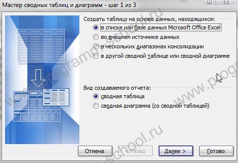
The Pivot Table Wizard window will open. We put everything as in the picture:
In the next window, you must specify the range of data from which you want to build a pivot table. Using the mouse, select all rows and columns in the “Option 1” table (already selected by default).

In the video example I indicated the range "Option 1"!$A:$G

This is necessary if the table is constantly updated with data, and constantly building a table can be very difficult or simply lazy :) Thus, I specified a range of columns, but the range of rows is limited only by Excel capabilities (in 2003 it is 65536 rows, in 2007 - 2010 more than 1 million lines). But this method has a slight drawback: the “empty” criterion appears in the tables (you will see later). Although it doesn't really bother me.

At this step we indicate where to create the table. We leave " new leaf" You can also immediately build a layout (in my opinion, it is more convenient to do this using the method described below, it is more visual) or set some parameters to the table. But all this can be corrected in the future.
Click " Ready».
We will see the following picture
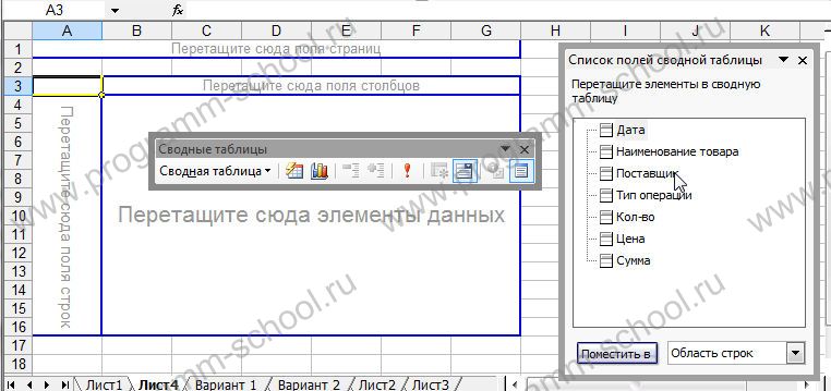
This is the layout of our table. The left side should contain criteria, such as names of counterparties, types of transactions, etc. At the top there are also text criteria. The difference is that the left part will be reflected as a ribbon, breaking down the data, and the top will allow us to select a criterion; the main (large) area contains data (amounts, quantities, etc.). A little higher, the area allows you to divide this data, for example, by date or month, etc.
The table is built by dragging fields from " List of Pivot Table Fields» to the required areas. Let's drag the fields into the following zones:
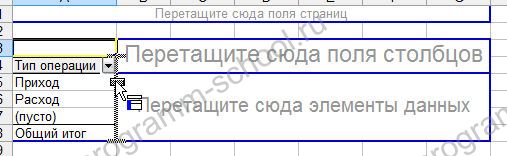
Type of operation – drag to the left zone

Supplier – also to the left, but slightly to the right of Operation Type;
We drag the name of the product to the upper zone;

We drag the Quantity and Amount to the largest zone alternately;

To break down by date, drag the Date field to the zone just above the data area;

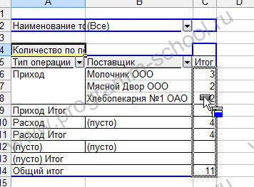
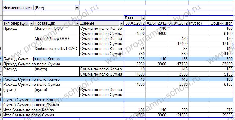
As a result, we get the following table:
The table turned out to be too crowded with totals and in the Sum and Quantity fields it is not the sum of values that is counted, but their number.
Let's fix it.
In order to change the calculation option, you need to move the mouse pointer over the line “Quantity by the Qty field” and “Quantity by the Amount field” so that it looks like a black arrow:
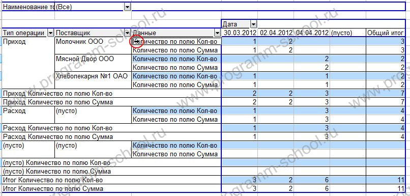
By clicking once with the left mouse button, all the rows of the “Quantity by field Qty” group should be highlighted as in the picture above.
Now right-click and in the context select the item “ Field Options»
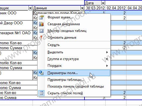
In the calculation parameters window that opens, select “ Sum»

Do the same for the rows of the “Quantity by Amount” group/
Now let's hide the unnecessary total lines. For this purpose we also select groups:
And in the context menu select the item “ Hide»

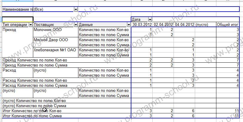
As a result, you should get a table that looks like this:
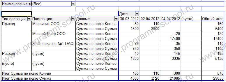
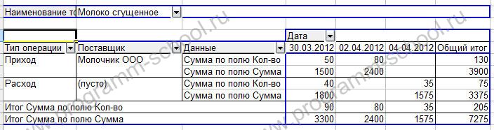
All. You can now view various information using the selection criteria. For example, let's see who brings us condensed milk, in what quantity and for what amount. To do this, click in the product name field on the arrow image and select from the list:

You will get a table like:
By changing the set and order of fields, we can display and calculate data in any form convenient for us, be it data by day, supplier, name, grand total, etc. I understand that the topic is quite complex and it is very difficult to describe it in detail. Therefore, watch the video demonstration below to secure it.
That's all for now. In the future, we will learn how to build tables using data from databases and build charts based on pivot tables.
Attached file: svodnaya_excel.zip
Video: Building a pivot table in Excel
Pivot tables are considered one of Excel's most powerful tools for working with data. They exist in order to simplify a complex and cumbersome table, and make the results of calculations simple, understandable and accessible. But! Not every table can be used to create a summary table.
The table must be in the form of a regular list, that is, column headings can only be in the first row. I have given an example of such a table in Fig. P1.1.
If you have any intermediate headings or subtotals in your table, then they need to be removed. In order not to explain in words all the benefits of a pivot table, I will show it with an example. Click the Pivot Table button in the Tables group of the Insert menu (Fig. A1.2).
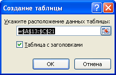
A window will open. In it, you must first select the table or table range for which you are creating a pivot table, and specify where to place it. You can place it on a new sheet, or you can place it next to the original table, on the same sheet, whichever is more convenient for you (Fig. A1.3).
I inserted a pivot table onto the same sheet. A designer panel for creating a pivot table has appeared on the right side of the window, and at the top there is a new group of tabs - Working with pivot tables.
How is a pivot table made?
On the right side of the panel, called PivotTable Field List, you see a list of column headings from the table shown in Figure. P1.1. From these fields you can now, like from a constructor, create a new table. To do this, you need to drag the field name to the required area with the mouse. I decided that I would have the names of the months in the columns of the pivot table, and the last names in the rows, and I would fill the Values field with the values from the Received column. That is, the summary table will only include data on money received. The result is shown in Fig. P1.4.

The PivotTable is called this because it brings all your results into a simple table, summing up the overall results. IN in this case the table summarizes the data (in the Values column it says Sum in the Received field). By the way, open the list of the Calculations button on the Parameters tab (Fig. A1.5).
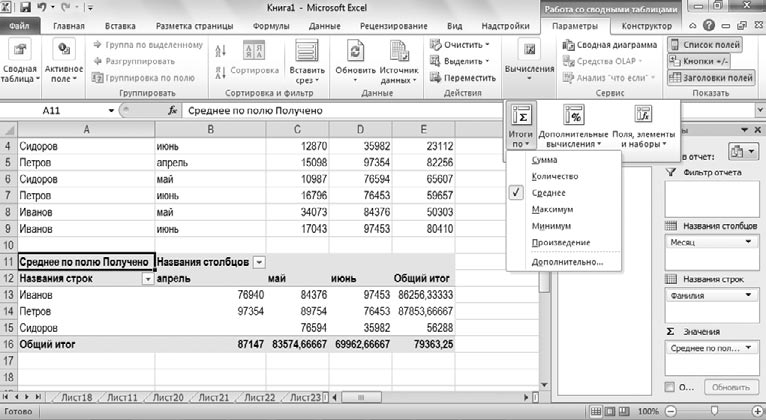
I set the results according to the average value, and, as you can see in Fig. P1.5, now the pivot table does not calculate the sum by month and last name, but the average value: the average salary by month and the average by employee. In addition, you can create a summary chart based on the values in the pivot table (Fig. A1.6).

This brings up a group of tabs called Working with PivotCharts, which is nothing new to you. We looked at all this when we looked at how regular diagrams work. By the way, please note: I swapped the rows and columns, so the totals are now calculated according to the value of the Remaining column (see Fig. A1.6). I did this just so you know that the column, row, and value field values can be shuffled to suit your needs.
You can also insert a slice into a pivot table. This is an additional filter that allows you to make the result even clearer (Fig. A1.7).
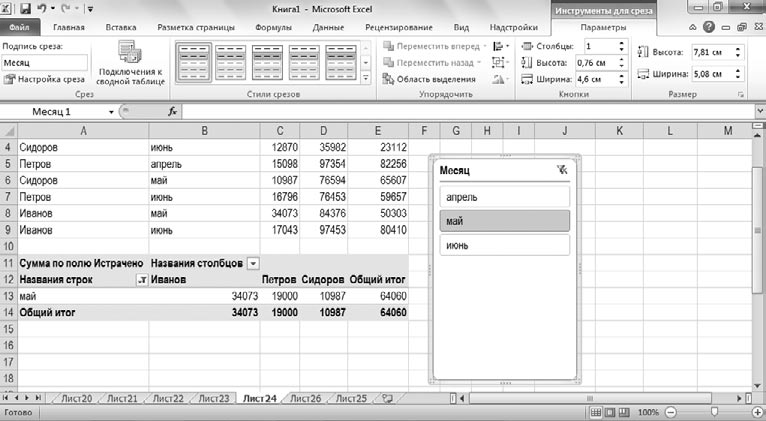
In the Sort and Filter group of the Options tab, click the Insert Slicer button and select the parameter by which you want to filter the data. I indicated the month. Now you can select a specific month in the slice window, and the pivot table will display only data related to this month (see Fig. A1.6). You will also have a whole tab at your disposal - Cutting Tools. By the way, you can insert not just one slice into the table, but several.
I told you the simplest techniques for working with pivot tables. If you understand this, you can understand everything else. Just do not forget that before creating a pivot table, the source table needs to be prepared for this, that is, make sure that it does not contain any intermediate headings and totals. Well, if something is still unclear or you want to study the capabilities of pivot tables in more detail, then I recommend turning to the materials on the special site Pivot Tables Excel 2010, which is entirely devoted to methods of working with data in Pivot Tables Excel 2010.
29.10.2012Pivot tables are necessary for summarizing, analyzing and presenting data located in “large” source tables, in various sections. Let's look at the process of creating simple Pivot Tables.
Pivot tables (Insert/Tables/PivotTable) can be useful if the following conditions are simultaneously met:
- there is a source table with many rows (records), we are talking about several tens and hundreds of rows;
- it is necessary to conduct data analysis, which requires sampling (filtering) data, grouping it (summarizing, counting) and presenting data in various sections (preparation of reports);
- This analysis is difficult to carry out on the basis of the original table using other means: ( CTRL+SHIFT+L), ;
- the source table satisfies certain requirements (see below).
Users often avoid using Pivot tables, because We are sure that they are too complicated. Indeed, mastering any new tool or method requires effort and time. But, as a result, the effect of mastering something new should exceed the efforts invested. In this article we will figure out how to create and use Pivot tables.
Preparing the source table
Let's start with the requirements for the source table.
- each column must have a heading;
- Each column must contain values in only one format (for example, the Delivery Date column must contain all values in only the format date; column “Supplier” - company names only in text format or you can enter the Supplier Code in numeric format);
- the table should not contain completely empty rows and columns;
- “atomic” values must be entered into cells, i.e. only those that cannot be separated into different columns. For example, you cannot enter an address in one cell in the format: “City, Street name, building no.” You need to create 3 columns of the same name, otherwise Pivot table will work ineffectively (if you need information, for example, by city);
- Avoid tables with the “wrong” structure (see picture below).
Instead of producing repeating columns ( region 1, region 2, ...), in which there will be an abundance of blank cells, rethink the structure of the table, as shown in the figure above (All sales values should be in one column, and not spread across several columns. In order to implement this, you may need to maintain more detailed records (see figure above), rather than showing total sales for each region).
More detailed tips on building tables are presented in the article of the same name.
Makes the construction process a little easier Pivot table, the fact that if the original ( Insert/Tables/Table). To do this, first bring the source table into compliance with the above requirements, then select any table cell and call the menu window Insert/Tables/Table. All fields in the window will be automatically filled in, click OK.
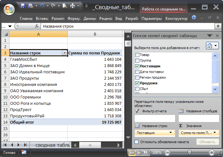
Now let's put a tick in the List of Fields next to the Sales field.
![]()
Because Since the cells in the Sales column are in numeric format, they will automatically appear in the Values Field List section.
With a few mouse clicks (six to be exact), we created a Sales report for each Product. The same result could be achieved using formulas (see article).
If you need, for example, to determine sales volumes for each Supplier, then to do this, uncheck the Product field in the List of Fields and check the Supplier field.
Drilling down on PivotTable data
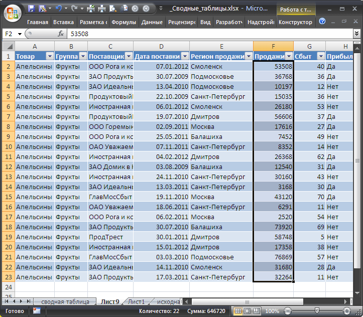
If you have questions about what data from the source table was used to calculate certain values Pivot table, then just double click the mouse on a specific value in Pivot table so that a separate sheet is created with rows selected from the original table. For example, let's look at what records were used to summarize sales of the Product “Oranges”. To do this, double-click on the value 646720. A separate sheet will be created only with the rows of the source table related to the Product “Oranges”.
Updating the PivotTable
If after creation Pivot table new records (rows) were added to the source table, then this data will not be automatically taken into account in Pivot table. To update Pivot table select any of its cells and select the menu item: menu Working with Pivot Tables/ Options/ Data/ Refresh. The same result can be achieved through the context menu: select any cell Pivot table Update.
Removing a PivotTable
Delete Pivot table possible in several ways. The first is to simply remove the sheet from Pivot table(unless there is other useful data on it, such as the original table). The second way is to delete only the Pivot table: select any cell Pivot table, press CTRL+ A(all will be highlighted Pivot table), press the key Delete.
Changing the totals function
While creating Pivot table grouped values are summed by default. Indeed, when solving the problem of finding sales volumes for each Product, we did not care about the totals function - all Sales related to one Product were summed up.
If you need, for example, to count the number of sold batches of each Product, then you need to change the totals function. To do this in Pivot table Totals by/Quantity.

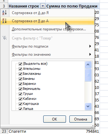
Changing the sort order
Now let's modify ours a little Consolidated report. First, let's change the order of sorting the names of Products: sort them in reverse order from Z to A. To do this, use the drop-down list at the header of the column containing the names of Products, go to the menu and select Sorting from Z to A.
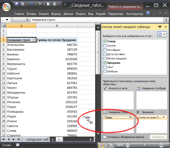
Now let's assume that Baranka's Product is the most important product, so it needs to be displayed in the first line. To do this, select the cell with the Baranki value and place the cursor on the cell border (the cursor should look like a cross with arrows).
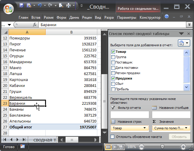
Then, left-click and drag the cell to the topmost position in the list, directly below the column header.
After the mouse button is released, the Baranka value will be moved to the top position in the list.
Changing the format of numeric values
Now let's add a separator for digit groups for numeric values (Sales field). To do this, select any value in the Sales field, right-click the context menu and select the menu item Number format…

In the window that appears, select a number format and check the box Thousand group separator.

Adding new fields
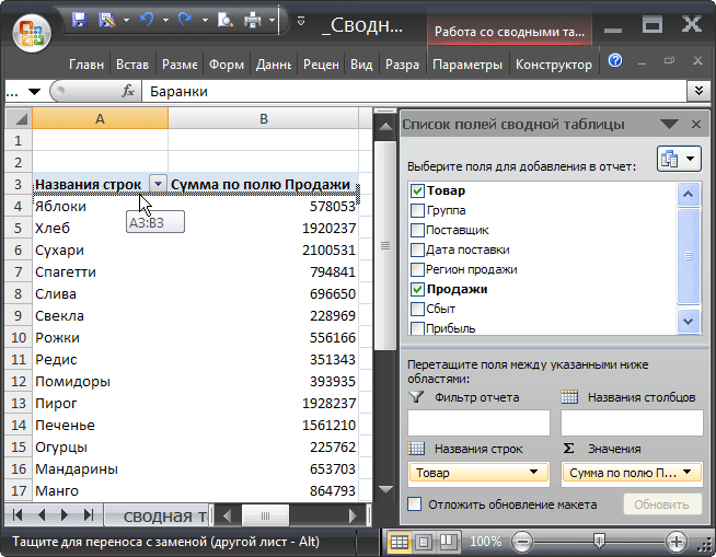
Let's assume that it is necessary to prepare a report on sales of Products, but broken down by Sales Region. To do this, add the Sales Region field by checking the appropriate box in the List of Fields. The Sales Region field will be added to the Line Names area of the Field List (to the Product field). By changing in the area Line names List of fields, the order of the fields Product and Sales Region, we get the following result.

By highlighting any Product name and clicking the menu item Working with Pivot Tables/ Options/ Active Field/ Collapse All Field, can be collapsed Pivot table to display only sales by Region.

Adding Columns
Adding the Sales Region field to the row area resulted in Pivot table expanded to 144 lines. This is not always convenient. Because sales were carried out only in 6 regions, then the Sales region field makes sense to place in the column area.
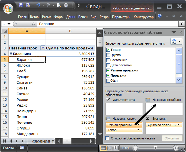
Pivot table will take the following form.
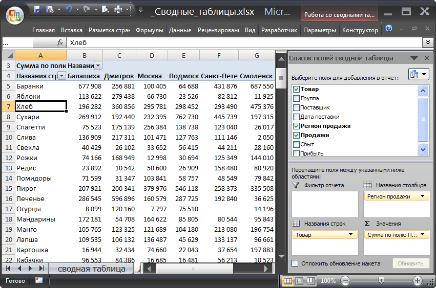
Swap columns
To change the order of columns, you need to grab the column header in Pivot table drag it to the desired location.
Removing fields
Any field can be removed from the PivotTable. To do this, you need to hover the mouse cursor over it in the Field List (in the Report Filter, Report Names, Column Names, Values areas), press the left mouse button and drag the field to be deleted beyond the border of the Field List.
Another way is to uncheck the box next to the field to be deleted at the top of the Field List. But, in this case, the field will be removed immediately from all areas of the Field List (if it was used in several areas).
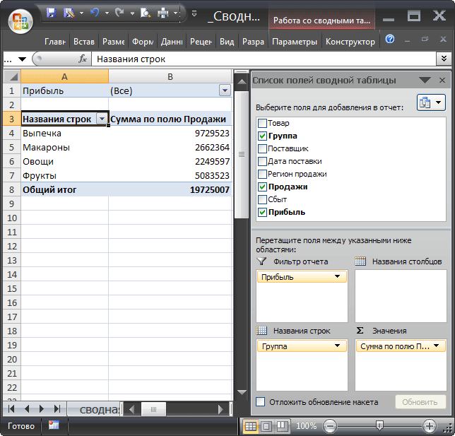
Adding a filter
Let's assume that it is necessary to prepare a report on sales of Groups of Products, and it needs to be done in 2 versions: one for batches of Products that brought profit, the other for unprofitable ones. For this:
- Pivot table, click menu item ;
- Check the boxes next to the Group, Sales and Profit fields in the List of Fields;
- Move the Profit field from the Line names area of the Field List to the Report Filter area;
View of the resulting Pivot table should be like this:
Now using Drop-down (drop-down) list in a cell B1 (Profit field) you can, for example, build a report on sales of Product Groups that brought profit.

After clicking the OK button, the Sales values of only profitable Lots will be displayed.
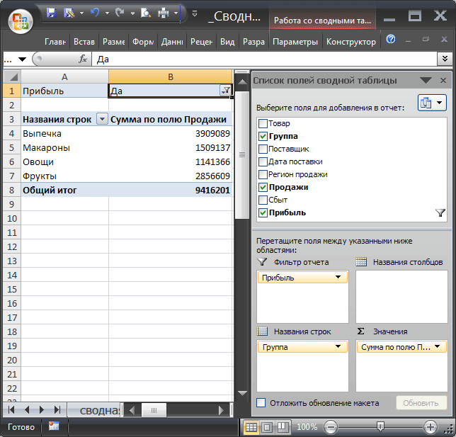
Please note that in the Field List Pivot table A filter icon has appeared opposite the Profit field. You can remove a filter by unchecking the box in the Field List.
You can clear the filter through the menu Working with Pivot Tables/Options/Actions/Clear/Clear Filters.
Data is also available through a drop-down list in the row and column headers Pivot table.
Multiple totals for one field
- Let's clear the previously created report: select any value Pivot table, click menu item Working with Pivot Tables/Options/Actions/Clear/Clear All;
- Check the boxes next to the Product and Sales fields at the top of the Field List. The Sales field will be automatically placed in the Values area;
- Drag another copy of the Sales field into the same Values area. IN Pivot table 2 columns will appear counting the sales amounts;
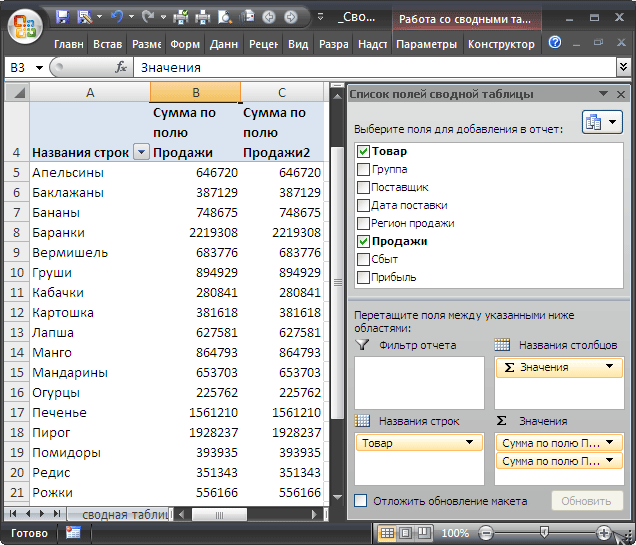
- V Pivot table select any value in the Sales field, right-click the context menu and select Totals by/Quantity. The problem is solved.

Disabling total lines
The totals line can be disabled via the menu: Working with Pivot Tables/ Designer/ Layout/ Grand Totals. Don't forget to first select any cell Pivot table.
Grouping numbers and dates
Let's assume that you need to prepare a report on sales timing. As a result, you need to obtain the following information: how many batches of the Product were sold in the period from 1 to 10 days, in the period 11-20 days, etc. For this:
- Let's clear the previously created report: select any value Pivot table, click menu item Working with Pivot Tables/Options/Actions/Clear/Clear All;
- Check the box next to the Sales field (date of actual sale of the Product) at the top of the List of Fields. The Sales field will be automatically placed in the Values area;
- select the single value of the Sales field in Pivot table, call the context menu with the right mouse button and select Totals by/Quantity.
- Drag another copy of the Sales field into the Line Names area;
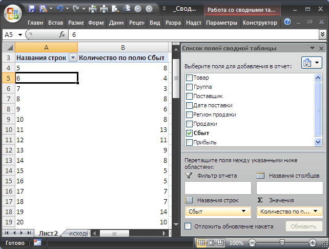
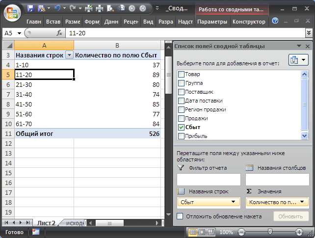
Now Pivot table shows how many batches of the Product were sold in 5, 6, 7, ... days. There are 66 lines in total. Let's group the values in increments of 10. To do this:
- Select one value Pivot table in the Row Names column;
- From the menu, select Group by field;
- Fill out the window that appears as shown in the figure below;

- Click OK.
Now Pivot table shows how many batches of the Product were sold in the period from 1 to 10 days, in the period 11-20 days, etc.
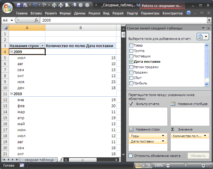
To ungroup values, select Ungroup on the menu Working with Pivot Tables/Options/Group.
A similar grouping can be done using the Delivery date field. In this case the window Group by field will look like this:
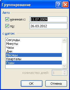
Now Pivot table shows how many batches of the Product were delivered each month.
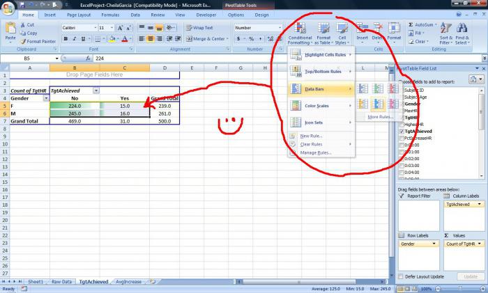
Conditional formatting of PivotTable cells
To cells Pivot table you can apply the rules just like to cells in a regular range.
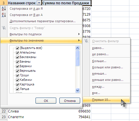
Let's highlight, for example, the cells with the 10 highest sales volumes. For this:
- Select all cells containing sales values;
- Select menu item Home/ Styles/ Conditional Formatting/ Rules for selecting the first and last values/ Top 10 elements;
- Click OK.